The Colour Wheel: Warm versus Cool
We are surrounded by colour in our lives and we think and talk about colours and their effects all the time. We can’t even serve a meal without making sure we have the right mix of colours on our plates!
Those of us who are artists are involved with colours constantly.
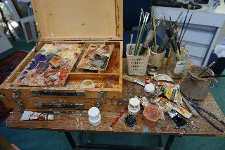
To make a decision, the artist employs his/her understanding of colour.
The ArtClassCurator has some excellent guidelines on using colour which I will utilise in this blog.
If you are learning to paint I hope that this information will help you.
Primary Colours
These colours (red, yellow and blue) form the baseline for all other colours. You cannot mix other colours to get red, yellow or blue.
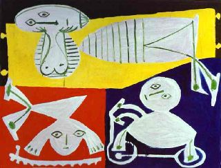
When I think of colour in relation to famous artists, Pablo Picasso immediately comes to mind. Below is an excellent example of a painting which exploits the fundamental power of the primary colours.
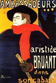
Henri de Toulouse-Lautrec also utilised the primary colours for his famous lithograph poster Ambassadeurs Aristide Bruant in his Cabaret, 1892.
Next we have Complementary (Secondary) Colours which are opposite each other on the colour wheel: green, orange and purple.
Complementary colours are used in art to create contrasts.

There are three basic sets of complementary colours: red and green, purple and yellow, orange and blue.
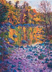
If we return to the paintings of Erin Hanson you will note she is using complementary colours to effect contrast. The painting Colour Reflection below utilises the contrast between tones of orange and the mauve/purple/blue range.
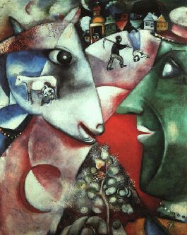
In Marc Chagall's painting I and the Village, complementary colours are also used.
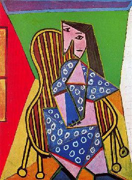
And Picasso’s Woman in Striped Armchair (1941) is probably one of the best examples of the use of sets of Complementary Colours working against each other in our minds to create dramatic dichotomies between the shapes.
The colour wheel also contains what are termed Analogous Colours being those colours that appear next to each other on the wheel. Some examples would be:
blue, blue-green and green or orange, red,orange and red.
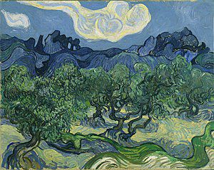
The use of these colour sets create unity and cohesion between the shapes because these colours are made from the same base colours.
An example below is The Olive Trees by Vincent van Gogh.
Australian painter Ben Quilty also makes great use of Analogous Colours to create his remarkable paintings. In his painting of Beryl (for the 2005 Archibald Prize), analogous colours in pale flesh tones are used to portray a sense of dignity and tranquillity in Beryl's face. The flash of turquoise in her hair, a complementary colour, establishes the line to pursue to also find harmony in her clothing with the blue/greens. Often with the use of analogous colours one colour dominates, as seen in the portrait of Beryl where the turquoise and dark blue are used for highlighting and shadow on the basic blue/green shirt.
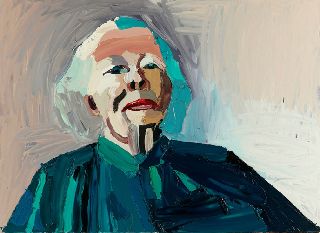
Of interest is that the subject of Ben Quilty’s portrait (above) is Beryl Whiteley, mother of acclaimed Australian artist, the late Brett Whiteley, and the founder and patron of the Brett Whiteley Travelling Art Scholarship. Very soon we are going to study more of the paintings created by Ben Quilty, especially the works he produced as Australia’s Official War Artist.
Warm Colours such as red, orange and yellow, give energy and life to a painting. The warm colours evoke strong emotions especially of optimism and hope. We all love a sunset for this very reason.
I paint predominantly in warm colours and not only because I live in a country that gets very hot in the summer. I love the vitality that the reds, oranges and incredible range of yellows give to an image which aims to embrace the audience.
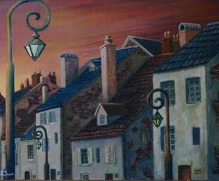
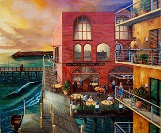
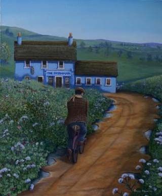
Very occasionally I explore the use of the Cool Colours of the blues and greens which, as you can see in my paintings below, give off a totally different feel: one of calm and comfort.
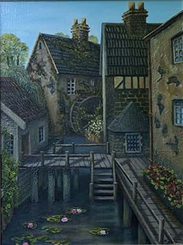
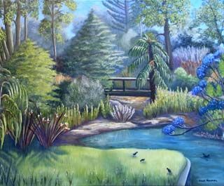
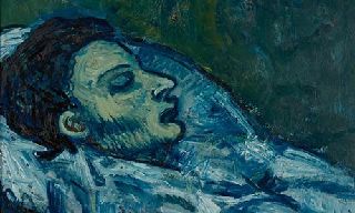
But cool colours, especially blue can also convey sadness or doom. Look at Picasso's tribute to his friend, Casagemas (1901) - all blue with a touch of blue/green to evoke some feeling of naturalness and peace.
Teaching Hint: Violet/purple can be both warm and cool depending on how much red or how much blue is in the violet.
In the next post we are going to look at the two artists who can be considered to have changed the way painters perceive colour. Probably that should be three artists because as we know from Jane’s earlier post, one, an unknown Australian called John Russell, taught the famous one about colour!
Follow this link if you would like to know more about The Colour Wheel.
Credits
- pablo-ruiz-picasso.net
- wikiart.org
- uxplanet.org
- erinhanson.com
- en.wikipedia.org
- artgallery.nsw.gov.au
- theguardian.com
