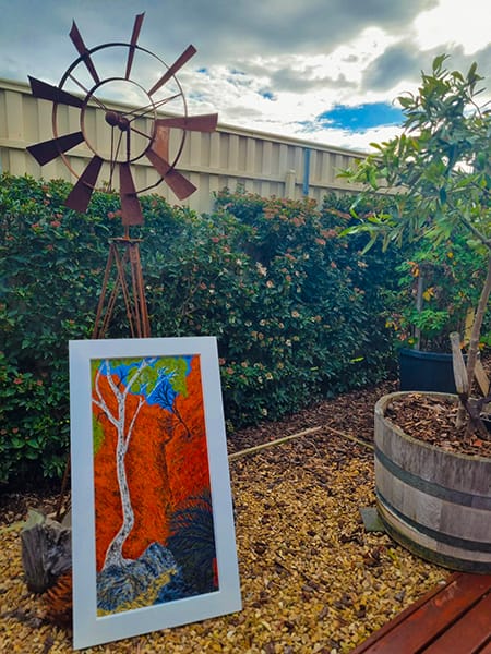
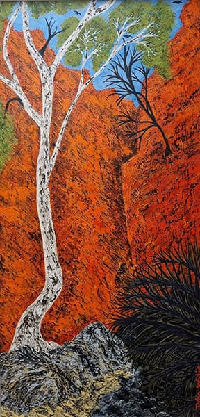
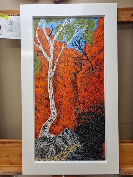
“Chasm Light at Noon” by John 'Rowdy" Wylie

Zooming in to take a closer look we can see the creative trade marks of Rowdy -

Rowdy's predominant use of the colors orange, white, light green, and dark green to create this scene combine to create a vivid and dynamic representation of the iconic Australian outcrops and chasms. The occasional dark black lines emphasise the contrast between the light and the dark.
Orange evokes the rich, earthy tones of the desert soil and the iconic red rocks, infusing the painting with warmth and the intense heat of the Australian sun can almost be felt rising from the canvas.
White can symbolize the stark, bright light that bathes the outback but Rowdy has used it to create a sharp contrast between gum and rock.
The light green of the gum leaves also contrast effectively against the red rock face and introduces a sense of the sparse yet hardy vegetation that manages to thrive in this arid environment, adding a touch of life and resilience.
And finally Rowdy has added a touch of dark green to depict an even tougher, more enduring plant life thus providing depth and a sense of permanence.
Together, these colors not only capture the visual essence of the outback but also convey the contrasts and harmonies of life in such an extreme and beautiful environment.
Well done Rowdy - Chasm Light at Noon is a great painting.
Every Rowdy Wylie painting is framed in a distinctive white frame which contrast with the striking oranges and reds of the composition.

It is interesting to take a moment to think about the effect different colours have on us.
Bright, warm colors (reds, oranges, yellows) stimulate energy and happiness while cool, subdued colors (blues, greens, purples) are soothing and calming. Bright, warm colors are best in rooms for entertaining like dining rooms or kitchens, while cool colors work best in relaxing spaces like bedrooms or even bathrooms.1
In paintings of the Australian outback, the vibrant hues of orange and red evoke the intense beauty and drama of the landscape, capturing the raw, elemental essence of the region. These colors, often inspired by the rich ochre earth and the fiery glow of the setting sun, infuse the artwork with warmth and vitality, enhancing the sense of ruggedness and grandeur.1
Red symbolizes the lifeblood of the land, connecting to ancient Aboriginal traditions and the spiritual significance of the terrain, while orange represents the constant interplay between the sun and the scorched earth, creating a dynamic, almost pulsating atmosphere.1
Together, these colors not only convey the visual impact of the outback’s expansive deserts and rocky ranges but also reflect its inherent energy and resilience, drawing viewers into a deep, visceral connection with this iconic landscape.1
Rowdy Wylie is a colourist and as such his paintings evoke strong reactions. You might like to take a few moments to check out the following websites on how different colours influence our moods.
:max_bytes(150000):strip_icc()/woman-painting-wall-while-renovating-home-1268400224-3cb3bf46d8b7464bbc1583b27c23160c.jpg)
:max_bytes(150000):strip_icc()/female-athlete-leaping-through-smoke-667521275-5a51341f845b3400374056f1.jpg)

Credit
1. ChatGPT under instructions from Anne Newman


