Colour in Our Lives & in Art

One of the most distinguishing features of modern life is Colour. Never before has colour so dominated our lives. Never before have we had so many hues, tints, tones and shades to choose from. Thanks to advances in science and technology, the range of colours available in clothing, objects, and for artists - paints - is enormous. Colour has changed our world and the way we see our world.
Colour has an enormous effect on us. Colour is used to control our world, control our reactions. Colour is used to help keep us safe through traffic lights, safety signs and such. This has been graphically captured by Marcin Wilk.

(Credit: Saatchi Art)
But our reactions to colour are far more complicated than stopping at a red light. The marketing people know this and exploit our emotional reactions.
Red for power as illustrated by Mithu Biswas in Horse Power.

(Credit: Ardizen)
Blue for Trustworthiness

(Credit: Michael Nichols)
Pink?- if you have a small female child in your life you will know
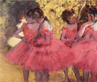
the answer! And Edgar Degas in The Pink Dancers Before the Ballet knew the power of pink in 1884.

(Credit:
All the colours have their special power.
Artists invented the first pigments—a combination of soil, animal fat, burnt charcoal, and chalk—as early as 40,000 years ago, creating a basic palette of five colors: red, yellow, brown, black, and white. Since then, the history of color has been one of perpetual discovery, whether through exploration or scientific advancement. The invention of new pigments accompanied the developments of art history’s greatest movements—from the Renaissance to Impressionism—as artists experimented with colors never before seen in the history of painting. (artsy.com)
RED - as shown in this section of a rock wall painting c.5000-2000BC.

(Credit:artsy.net)
Found in iron-rich soil and first employed as an artistic material (as far as we know) in prehistoric cave paintings, red ochre is one of the oldest pigments still in use. Centuries later, during the 16th and 17th centuries, the most popular red pigment came from a cochineal insect, a creature that could only be found on prickly-pear cacti in Mexico. These white bugs produced a potent red dye so sought-after by artists and patrons that it quickly became the third greatest import out of the “New World” (after gold and silver), as explains Victoria Finlay in A Brilliant History of Color in Art. Raphael, Rembrandt, and Rubens all used cochineal as a glaze, layering the pigment atop other reds (like red ochre) to increase their intensity. A non-toxic source for red pigment, the cochineal bug is still used to color lipsticks and blush today. (artsy.net)
BLUE - illustrated so beautifully in The Virgin in Prayer by Giovanni Battista Salvi da Sassoferrato painted between 1640-1650.

(Credit: artsy.com)
Ever since the Medieval era, painters have depicted the Virgin Mary in a bright blue robe, choosing the color not for its religious symbolism, but rather for its hefty price tag. Mary’s iconic hue — called ultramarine blue — comes from lapis lazuli, a gemstone that for centuries could only be found in a single mountain range in Afghanistan. This precious material achieved global popularity, adorning Egyptian funerary portraits, Iranian Qur’ans, and later the headdress in Vermeer’s Girl with a Pearl Earring (1665).

(Credit: artnet News)
For hundreds of years, the cost of lapis lazuli rivaled even the price of gold. In the 1950s, Yves Klein collaborated with a Parisian paint supplier to invent a synthetic version of ultramarine blue, and this color became the French artist’s signature. Explaining the appeal of this historic hue, Klein said, “Blue has no dimensions. It is beyond dimensions.” (artsy.com)
An example of Yves Klein's work. More on him later.

(Credit: britannica.com)
YELLOW- of course best represented by Vincent..

(Credit: artsy.com)
Few artists in history have been known for their use of yellow, though Vincent van Gogh and Joseph Mallord William Turner are the most notable exceptions. Below is Turner's Approach to Venice painted in 1844.

(Credit: artsy.com)
Turner so loved the color that contemporary critics mocked the British painter, writing that his images were “afflicted with jaundice,” and that the artist may have a vision disorder. For his sublime and sun-lit seascapes, Turner used the experimental watercolor Indian Yellow — a fluorescent paint derived from the urine of mango-fed cows (a practice banned less than a century later for its cruelty to animals). For brighter touches, Turner employed the synthetic Chrome Yellow, a lead-based pigment known to cause delirium. Vincent van Gogh also painted his starry nights and sunflowers with this vivid and joyful hue. “Oh yes! He loved yellow, did good Vincent, the painter from Holland, gleams of sunlight warming his soul, which detested fog,” wrote the painter Paul Gauguin of his friend and artistic companion.(artsy.com)
Yellow from the urine of cows!! Yes, this is fact!
GREEN - in all its glory and how beautifully captured in Mont Sainte-Victoire painted by Paul Cezanne in about 1885-1887.

(Credit: artsy.com)
While the color green evokes nature and renewal, its pigments have been some of the most poisonous in history. In 1775, the Swedish chemist Carl Wilhelm Scheele invented a deadly hue, Scheele’s Green, a bright green pigment laced with the toxic chemical arsenic. Cheap to produce, Scheele’s Green became a sensation in the Victorian era, even though many suspected the color to be dangerous for artists and patrons alike. The French emperor Napoleon Bonaparte’s bedroom wallpaper even featured Scheele’s Green, and historians believe the pigment caused the revolutionary’s death in 1821. By the end of the 19th century, Paris Green — a similar mixture of copper and arsenic— replaced Scheele’s Green as a more durable alternative, enabling Claude Monet, Paul Cézanne, and Pierre-Auguste Renoir to create vivid, emerald landscapes. Used as a rodenticide and an insecticide, Paris Green was still highly toxic, and may have been responsible for Cézanne’s diabetes and Monet’s blindness. Not surprisingly, it was eventually banned in the 1960s (artsy.com)
If you would like to know more about colour please follow this link to the Artsy article A Brief History of Color in Art.
As we know, not everyone sees colour the same way and colours have different meanings across cultures. Read about the
Spectacular Contradiction of Pink
A 17th-century Chinese word for pink meant foreign color. In Japan, it serves as wistful symbol of the slain samurai; in Korea, it’s interpreted as a sign of trustworthiness.(artsy.net)
But did you know that some people see music in colour? More on this coming up.
