Does the type of frame on an Impressionist painting matter?

Regular readers will know that the AnArt4Life team are very fond of the work of the Impressionists, particularly the French Impressionists. We have produced a number of posts about their lives and work, which you can find on our website TagCloud - click here.
Here in Melbourne, Australia, an exhibition of wonderful Impressionist paintings from the Museum of Fine Art in Boston has been on show at the National Gallery of Victoria (the NGV). However, not long after the exhibition opened, Melbourne went into lockdown due to the pandemic and the exhibition had to close before many of us were able to see it.
The NGV have very kindly made a number of “virtual tours” available, with wonderful presentations by the Curators and Art Directors. (I will provide the link to some of these at the end of this post in case some readers would like to watch any of them, from just a few minutes each, up to an hour.)
One of these presentations was a Question and Answer session about the exhibition, presented by The Faculty of Arts of The Melbourne University, in partnership with the NGV. One question from a viewer was about the very ornate frames that many of the Impressionist paintings are framed in.
I found the answer to the question very interesting and not something you hear about every day. With permission from the NGV and Melbourne University, here is the answer given by Dr. Ted Gott, Senior Curator at the NGV, and Melbourne University Alumni:
Q: Why do the Impressionist paintings have such ornate frames? Was it an attempt to “normalise” their work alongside the traditional realism of paintings at the time?
A: The short answer is yes, but was at the stipulation of the Impressionist’s art dealers, who were finding it difficult to sell their work as it was such a revoultionary break away from the traditional classical style.1
The Impressionists were influenced by the development of Colour Theory, especially by the French Chemist Michel Eugène Chevreul (31 August 1786 – 9 April 1889), (click here). His scientific work covered a wide range of areas in the medical field. He wrote several books on colour and even developed an early form of the colour wheel that we know today. He argued that white placed beside a colour heightened it’s tone. 1
So, from the Third Impressionist exhibition in 1877 onwards, the Impressionists put their paintings into white frames in a simple architrave style. For example, Pissarro showed all 22 of his paintings in that exhibition in white frames, and others in frames designed by Degas, as he was very interested in all aspects of showing their work to best advantage.
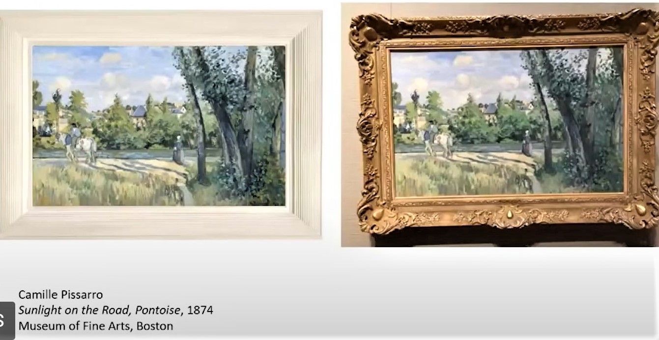
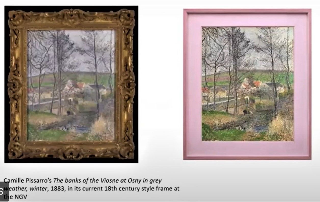
The image below is a screenshot of a mockup by Dr. Gott showing one of Pissarro’s paintings in the exhibition with the sort of white frame it may have had, compared to the ornate frame it now has. The difference in the vibrancy of the colours is clearly discernible, don’t you think?
A couple of years later into the 1880s, the Impressionists became even more innovative, using coloured (but simple) frames to enhance the vibrancy of the colours they used.
The colours chosen were complementary tints to the paintings inside them ... for a sunset where the dominant hue was red, a green frame; for a purplish canvas, a frame in a matte yellow; for a green spring landscape, a rose-coloured setting. 1
The image below is a screenshot of a mock-up by the Senior Curator at the NGV, Dr Ted Gott, showing another of Pissarro’s paintings in the exhibition with a lilac/pink frame, compared to the ornate frame it now has. The difference in the vibrancy of the colours is clearly discernible once again, don’t you think?
The Impressionists went even further though!
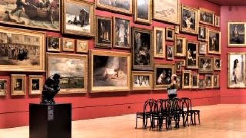
In the French Salon in the mid-1800s, you were allowed to show a maximum of three works, out of a total exhibition of three or four thousand works! It must have been very difficult to find one particular artist’s work amongst all those paintings, shown floor to celiling! Some people even brought binoculars or spyglasses so they could see the works up high near the ceiling! 1
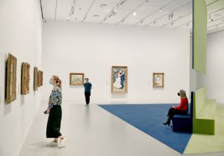
The NGV have reproduced the red colour of the Salon walls in one of the exhibition rooms at the NGV:
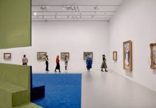
But in the Impressionists’ independent exhibitions they each carefully curated an individual room of their work, and thus were able to establish their own personality and style, "en masse" compared to being shown amongst thousands in the Salon in random placement.1
Furthermore, instead of using the traditional red colour of the Salon walls, they used a different colour in each room. It is said that Pissarro's work in one exhibition was hung in a room with lavender walls and yellow architraves! 1 Imagine that!
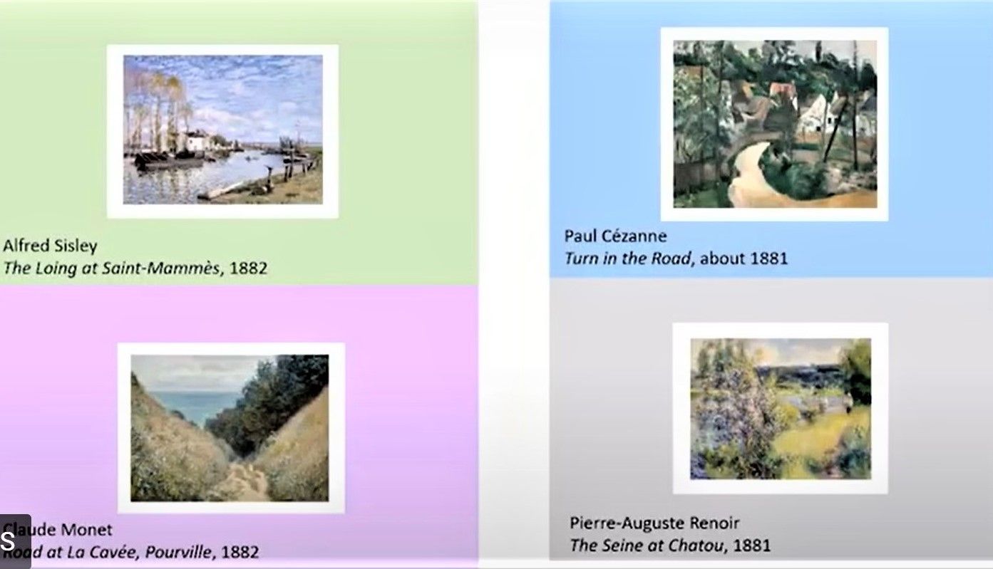
Here is a mock up by NGV Senior Curator, Dr. Ted Gott, of how the paintings may have looked in their white frames against different coloured walls in the Impressionist's exhibitions. So the Impressionists exhibitions were almost installations, rather than just exhibitions! 1
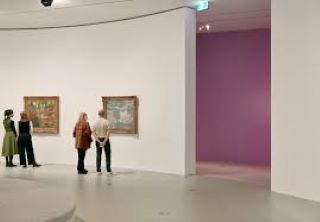
Apart from some of the original frames on works by Degas, none of the original frames used in these exhibitions have survived.
Many of the buyers of the Impressionists' works lived in lavish Parisian apartments full of traditional art in ornate Louis the XV Rococo frames, and the plain white or coloured fames used by the Impressionists did not look good beside these very ornate, traditional works.
So when people bought the Impressionist paintings the first thing they did was replace the frames with the classic gold frames which made them look more expensive and important. 1
The Impressionists' dealers begged them to not use their plain white or coloured frames and so, by the late 1880s the Impressionists went back to using gold frames, but they were much simpler without the ornate, carved decorations.
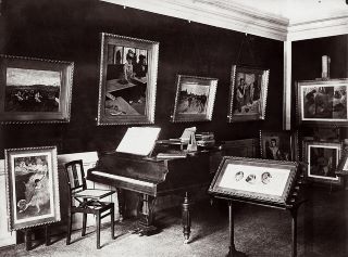
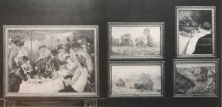
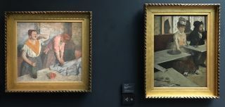
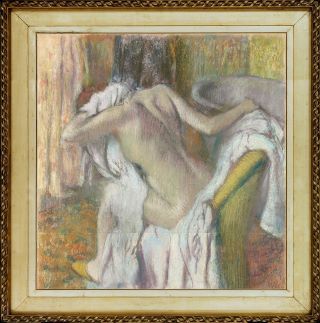
Here are some photos of Degas workroom, and some of the pictures as they remain today, in their “less ornate” gold frames.....if you look closely, you may recognise the some of these famous paintings by Degas, Renoir and Monet!
So, ........ do you think the choice of frame for a painting matters.....?
If you would like to watch any of the Masterclass programs offered by Melbourne University on the French Impressionists exhibition, which came to Melbourne from the Fine Arts Museum of Boston, please click here.
Footnotes
- With thanks to Dr. Ted Gott, Senior Curator at the NGV, and the Faculty of Arts, Melbourne University, and the National Gllaery of Victoria:
NGV Curatorial virtual tour link - 1 hour
https://youtu.be/-cvmhDcXhfQ
Monet in Place – 40 minutes
https://youtu.be/IfldAf7kLLE
Renoir’s Dancers at Bougival -1 minute
https://youtu.be/bWVX0JeS274
Mary Cassatt – an International Influence – 1 minute
https://youtu.be/Fbhqrd6z6DY