Be Brave with Colour

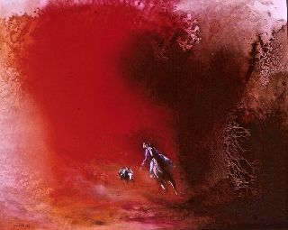
I've been talking with the artist John Pickup about using colour. His first piece of advice is to be brave and experiment with colour. Don't be frightened to add the unexpected as John has shown in his The Queen's Troubadour.

If you want to achieve striking visual effects use complementary colours which are the colours that are on opposite sides of the colour wheel.

(Credit: drawpaintacademy.com)
When they are used side by side these pairs of colours make each other look brighter.
Complementary colours were used by the Impressionists. As Claude Monet said: Colour makes its impact from contrasts rather than from its inherent qualities. Note the contrast in Monet's Grainstacks at Sunset between the dull blues and the orange in the sky.

(Credit: drawpaintacademy.com)
The Fauvists also utilised complementary colours to achieve the vibrancy they so desired. Below is The Green Line painted by Henri Matisse in 1905. Check out the colours against the colour wheel and try to imagine the effect if different colour choices had been made by Matisse.

(Credit: khanacademy.org)
And this wonderful painting is The River Seine at Chatou by Maurice de Vlaminck painted by 1906. Again, take a moment to understand the effect of complementary colours by checking the colours against the wheel.

(Credit: khanacademy.org)
If you would like to know a little more about Fauvism and especially two of the greatest exponents (Matisse and Andre Derain) please read this short article.
Radical Color and Wild Beasts: Matisse, Derain, and the Friendship that Defined Fauvism